


Charts in Netdata have always been interactive. You can zoom, pan, select time ranges, and see per-second granularity across thousands of metrics. But when you spotted something interesting, the next steps usually meant leaving the chart: opening another tab to check a related metric, navigating to the correlation tool, or pulling up a different time range for comparison. The investigation workflow lived outside the chart, even though the chart was where the investigation started.
Expanded Chart View changes this. Click the expand icon on any chart and it opens into a larger analysis workspace with several tools built in: period comparison, detailed dimension values and statistics, drill-down into related metrics, and correlation.

Compare across time periods
The compare tab lets you overlay data from different time periods on the same chart. You can compare the current view against the same time yesterday, last week, or any custom baseline you choose. This is one of the fastest ways to answer “is this normal?” When you’re looking at a load spike at 2pm, being able to see whether the same thing happened at 2pm yesterday, without opening a second chart or manually adjusting time ranges, saves real time during triage.

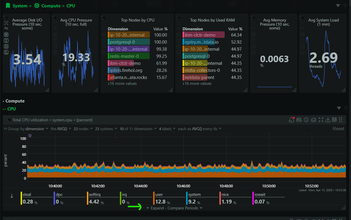
Dimension values and statistics
The values tab gives you a detailed breakdown of every dimension in the chart: current values, min, max, average, and other statistics over your selected time range. When a chart has many dimensions (think per-CPU core utilization or per-disk I/O), this is where you go to see exactly which dimension is the outlier rather than trying to read it off the visualization alone.

Drill down into related metrics
The drill-down tab uses metric weights to show you related metrics and child contexts that are most relevant to what you’re looking at. If you’re investigating a CPU spike, the drill-down will surface the processes, services, or containers that are contributing most to it. This is where the expanded view starts to feel less like a chart and more like an investigation tool, because it’s actively guiding you toward the next thing to look at.

Find correlated metrics
The correlate tab identifies metrics across your infrastructure that are behaving similarly to (or inversely to) the metric you’re looking at during the selected time range. If your web server response time spiked, the correlation view might surface a simultaneous spike in disk I/O on the same node, or a drop in available memory, or increased network retransmits. These are the connections that take the longest to find manually and often end up being the key to understanding what actually happened.

The investigation stays in one place
The common thread across all of these tabs is that they keep you in the same context. You don’t lose your selected time range. You don’t lose sight of the original metric. You go from “that looks wrong” to “here’s what’s related” to “here’s what probably caused it” without navigating away. For the kind of fast triage that on-call work demands, that continuity matters.