


When your infrastructure is spread across regions, data centers, branch offices, or edge locations, knowing where a node is physically located matters more than people usually admit. During an incident, “the node in the Singapore POP” communicates faster than a hostname. When you’re planning capacity, seeing geographic clustering tells you something that a flat list of nodes doesn’t. When a subset of your fleet starts misbehaving, the first question is often “is this regional?”
Netdata now supports geographic maps. Any node provisioned with latitude and longitude host labels in netdata.conf automatically appears on an interactive map. If at least one node in your space has coordinates, the geo map widget shows up on your home tab.
How it works
The setup is minimal. Add two host labels to a node’s netdata.conf:
[host labels]
    latitude = 60.1699
    longitude = 24.9384
Restart the agent, and the node appears on the map. That’s it. There’s no separate configuration page, no map setup wizard. Netdata detects the presence of coordinate labels and renders the map automatically.
The map is interactive. You can zoom, pan, and click on nodes or clusters to drill down. If you want the map to take up more space, you can go full screen or pin it as a dedicated tab in your navigation for quick access.
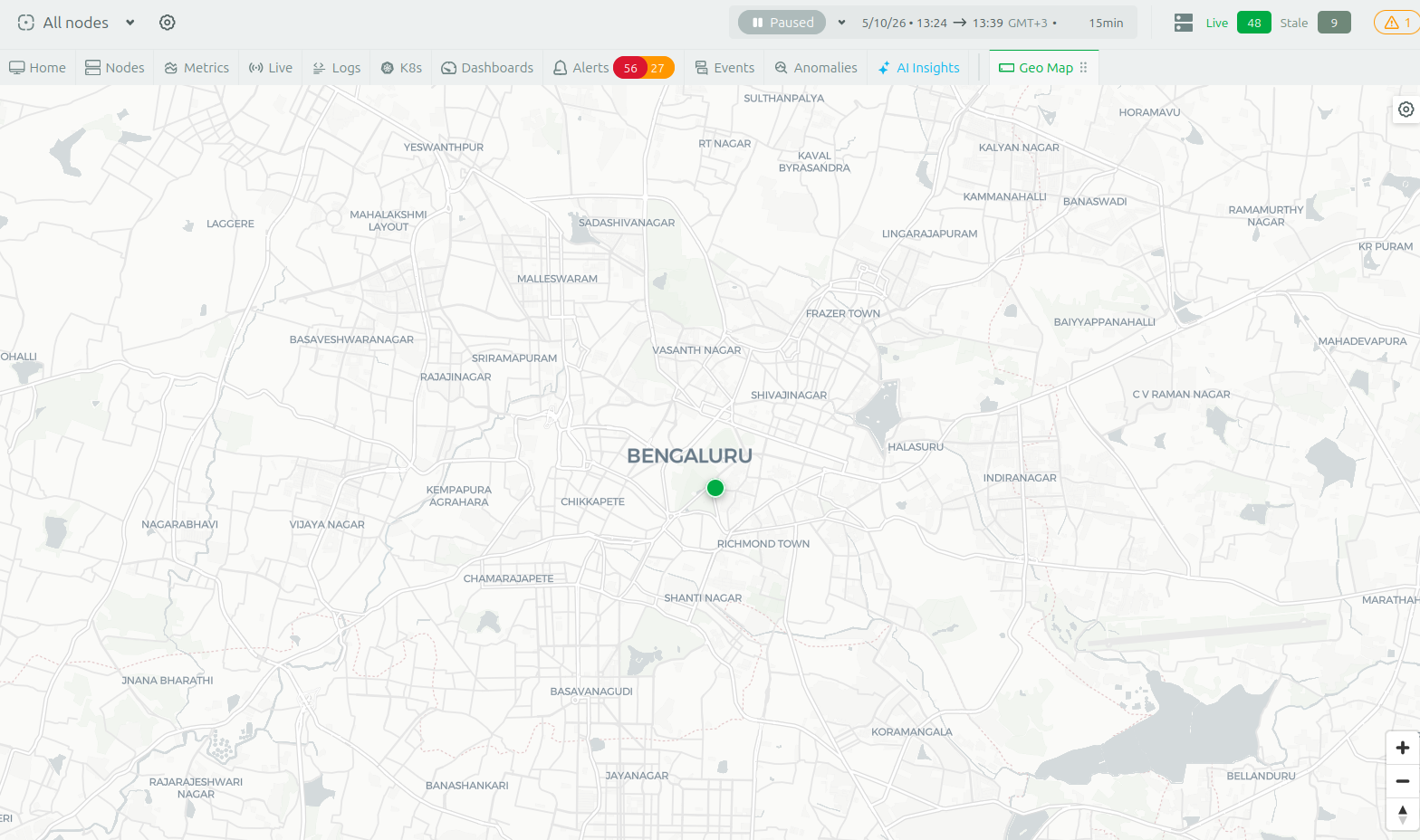
The map rendering is built on OpenStreetMap. We’re grateful to the OpenStreetMap community for making this kind of feature possible for open-source projects like ours.
Where this is useful
Geographic context is valuable any time your infrastructure isn’t sitting in a single rack.
Edge and IoT deployments are the most obvious case. If you’re running Netdata agents on retail store servers, industrial controllers, telecom POPs, or branch office appliances, a geographic view lets you see at a glance which locations are healthy and which need attention. When a regional ISP has an outage, the map shows the affected locations clustering together immediately.
Multi-region cloud and hybrid architectures benefit from seeing which region a problem is in before you start digging into individual nodes. If you’re running across AWS regions, Azure regions, or a mix of cloud and on-prem data centers, the map gives you a spatial overview that complements the logical groupings in your rooms and node groups.
CDN and content delivery operators can visualize their points of presence geographically. When latency complaints come in from a specific geography, seeing your POP locations on a map alongside their health status helps narrow down the investigation quickly.
MSPs and hosting providers managing infrastructure across multiple customer sites get a single view of where everything is. This is particularly useful during client calls when you need to show the state of their distributed deployment without switching between multiple views.
Field operations and logistics teams running monitoring on mobile or semi-permanent infrastructure (construction sites, event venues, fleet vehicles with onboard compute) can track where their monitored assets are physically located alongside their operational health.
Even for teams with a simpler setup, say two or three data centers, the map provides a satisfying visual confirmation of your infrastructure topology that’s immediately comprehensible to anyone on the team, including people who don’t interact with Netdata daily.
Getting started
Add latitude and longitude host labels to any nodes you want to see on the map. You can do this incrementally. Start with your most geographically significant nodes and add more over time. The map renders whatever has coordinates and ignores the rest.
If you manage your fleet with configuration management (Ansible, Puppet, Chef, Salt), pushing coordinate labels across your nodes is straightforward. You can pull coordinates from your CMDB, cloud provider metadata, or just look them up for each site.
This feature is available now for all Netdata users.