

Custom dashboards in Netdata have always let you pull charts together on-the-fly into a single view. That’s useful, but it’s also limited. In practice, when you’re running an incident or reviewing a service, you don’t just want charts. You want to see the output of top alongside your CPU metrics. You want slow query logs next to your database latency charts. You want an infrastructure summary card that tells you how many nodes in a room are healthy without having to click through to find out.
The new custom dashboards are built around this idea. Instead of a canvas that only accepts metric charts, you now have a builder that can combine metrics, live function views, logs and events, infrastructure summary cards, and free-form text into a single, shareable dashboard.
What you can put on a dashboard now
The old dashboards supported metric charts and that was essentially it. The new builder supports several distinct widget types, and the difference this makes is significant.
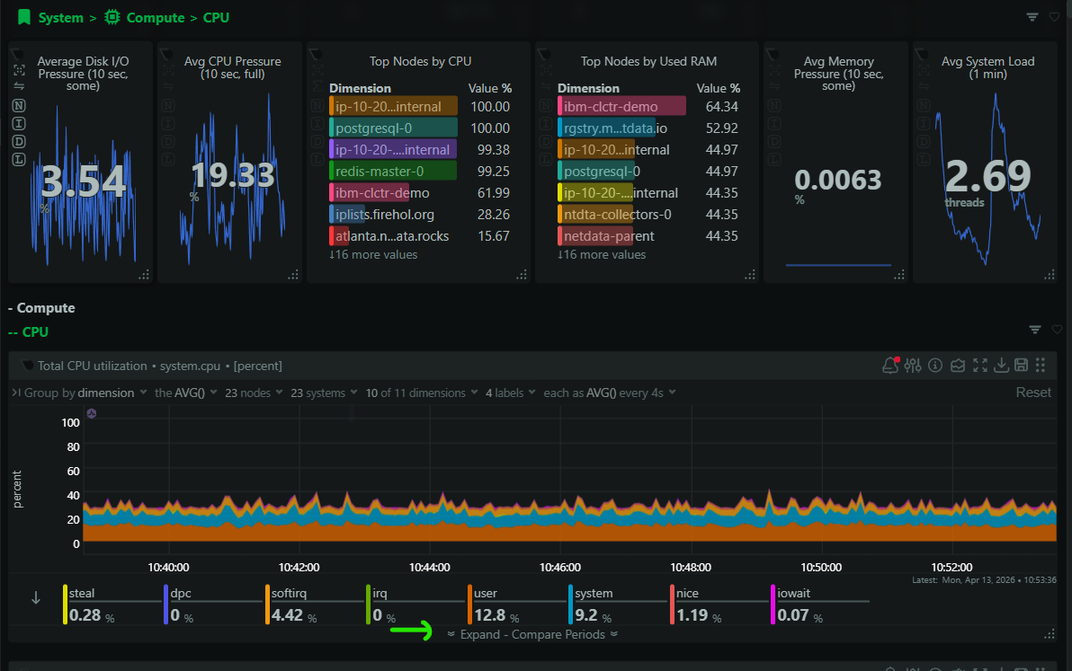
Metric charts remain the foundation. You pick your nodes, your metrics, your time window, and your visualization type. This part works the way you’d expect.
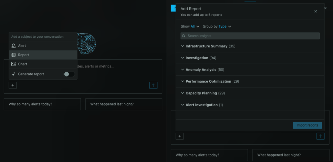
Live functions are where things get interesting. Netdata agents can execute functions in real-time on your nodes, things like top, netstat, sockstat, and more specialized views like database slow queries or the top N queries running right now. You can now embed these directly into a dashboard. This means you can build a “Database Health” dashboard that shows your query latency charts alongside a live view of the actual slow queries happening on your MySQL or PostgreSQL instances, updating in real time.

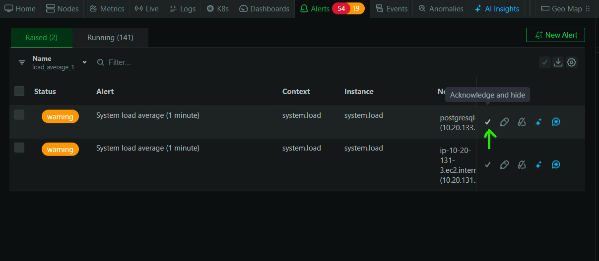
Logs and events can be added as dashboard widgets too. If you’re using Netdata’s systemd journal log exploration or any of the other log sources, you can embed a filtered log view directly into your dashboard. A web server dashboard can now show your Nginx request rate chart right next to the actual access or error log entries.

Infrastructure summary cards give you a high-level view of your nodes or rooms. These are the kind of widgets you’d put at the top of a dashboard to answer “is everything okay?” at a glance before diving into the details below. You can scope these to specific rooms, so a team that owns a particular set of infrastructure gets a summary that’s relevant to them.

Text blocks let you add context, runbooks, links, or instructions directly on the dashboard. Simple, but surprisingly useful when you’re building a dashboard that other people on your team will use during incidents.
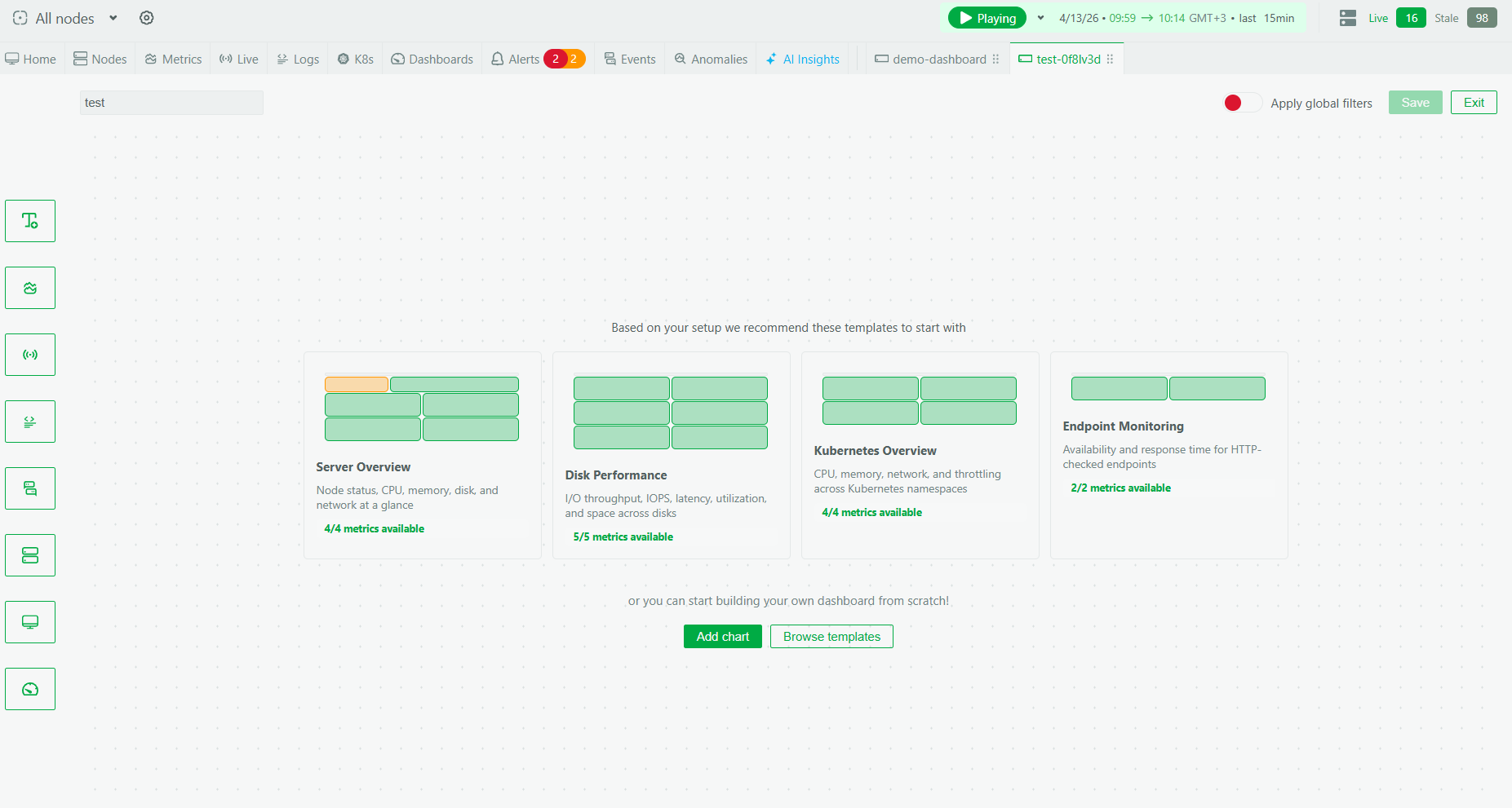
The new builder
The dashboard creation experience has been redesigned from scratch. The new builder gives you a preview-driven composition workflow where you can see what each widget will look like as you configure it, rather than adding things blind and rearranging afterward.

Node-aware scoping runs throughout the experience. When you add widgets, you can scope them to specific nodes or rooms, and this scoping is consistent across the dashboard. This matters when you’re building a dashboard for a specific service or environment rather than your entire infrastructure.
Pre-built templates
Not everyone wants to start from a blank canvas, and frankly, there are common dashboard patterns that most teams end up building anyway. We’ve added a set of pre-built templates that you can deploy with one click. These templates are populated with your actual data and give you a working dashboard immediately. And we plan to keep improving this template library continuously so that soon, you’ll be able to one-click create a beautiful purpose-built dashboard for almost any use-case you can think of.

The templates cover common scenarios like system overview, web server monitoring, database health, and others. Once deployed, you get a fully functional dashboard that you can use as-is or customize further by adding, removing, or rearranging widgets.

Why this matters
The practical difference here is that dashboards can now match the way you actually think about your infrastructure during different activities. An incident dashboard can combine the metrics that spiked, the live output of diagnostic commands, and the relevant logs all in one place. A leadership reporting view can show infrastructure summary cards and key SLI trends without any of the operational noise. A service-specific dashboard can scope everything to the nodes that run that service.
This is a meaningful step forward for custom dashboards in Netdata, and it’s the foundation for more improvements coming soon.
This feature is available now for all users.